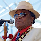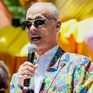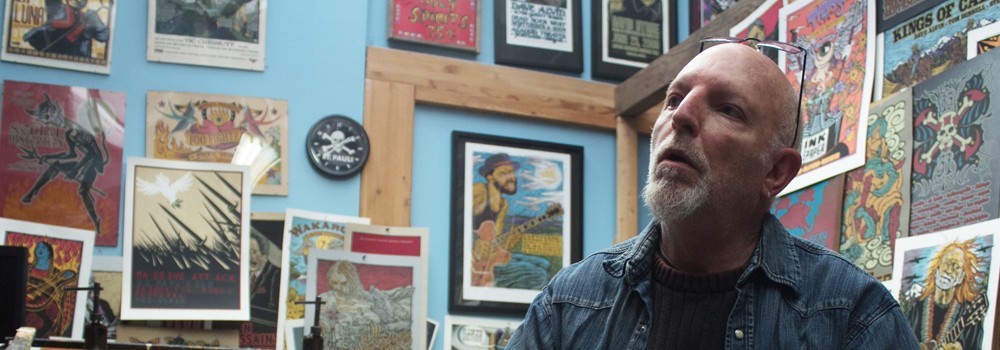
THE LAST THING GARY HOUSTON WANTS IS FOR YOU TO BE STARING AT A PICTURE OF HIS MUG SPLAYED ACROSS THE PAGES OF THIS MAGAZINE. HE MIGHT EVEN BE DOWNRIGHT UNHAPPY ABOUT WHAT YOU SEE ON THE COVER OF THIS ISSUE.
Maybe unhappy is too strong of a word. Humble almost to a fault, he's likely just a little apprehensive—uneasy about the fact that his face is on display rather than his artwork.
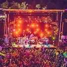
Yet, the work he does with his hands has unintentionally thrust open the curtains he was "wanting to stand behind," especially starting in 2001 when Houston—or at least his instantly recognizable scratchboard artwork with its woodblock feel—became the face of Portland’s Waterfront Blues Festival.
"It was never our intention to brand any of this stuff,” Houston explains. “It just happened," a reality that he's admittedly a bit shy about. Now in his 14th year as the festival's visual steward, it's impossible to imagine the state's largest music fest—as well as an annual Fourth of July celebration and fundraiser for the Oregon Food Bank—without Gary Houston.
 This organic evolution to a position of visible prominence is, rightfully, a theme in Houston's life, but in the version he tells, he's more likely to call it "stumbling along." Like a noodling jam at a Dead concert, "You never quite know where the stepping stones are going to lead you," he describes.
He's stepped on the right stones starting with a stint as a runner for a local concert promoter in Wichita, Kan., which afforded him the opportunity to work behind the scenes fulfilling memorable rider obligations—"I don't know how many pounds of dry ice for a Pink Floyd show," he recalls, utilized to mask the hydraulic lifts that made the moon rise into the night sky. Asked to "fill a lot of shoes," poster work was included, and as a senior in high school, Houston designed one of his first for the Grateful Dead's November 1972 appearance in town—a show that cost $5 (or $5.50 at the door). These days, he recently sold a copy of that small poster "for an obscene amount of money," he says disdainfully, and later reticently reveals that the nomadic jam band has several drawers of original hand-cut transparent separations (akin to the negative of a photograph) in his studio storage drawers, which translates to more than his fair share of Dead posters over the years.
Continuing to hone his craft as touring acts came through the Midwest, Houston remembers posters for Isaac Hayes ("back when he was referred to as the Black Moses"), loads of long-haired English rockers extending their invasion, and the early incarnations of Fleetwood Mac ("when they were still a real live blues band").
Following love to Oregon, he ended up in Portland in the early '80s, which is also when he really learned screen printing—even though he presumptuously thought he already knew it. In 1988, Houston opened a design studio with friends, doing graphic design and making promotional materials for trade shows, in the Pearl District—"back when the Pearl was really scary to go into" and rent ran just 17 cents a square foot, but you might "go down to get the mail and there'd be somebody sitting there with a needle, spoon and a lighter," he says.
 That said, it was an affordable artist’s enclave where he and his cohorts had a joke "that you could throw a rock and hit a photographer and it would bounce off and hit two graphic designers." So, besides the rent, maybe things haven't changed so much.
The business of making concert posters began in earnest in the mid '90s but it wasn't strictly a commercial endeavor. "When we started out, [we'd see that] yadda yadda was coming to town [and say] 'I want to do something.' Then you would do it and it would be your way to get into the show," Houston explains.
Working alongside "another poster guy here in town," Mike King, the pair dubbed themselves Voodoo Catbox and started by enlarging and screen printing some of King's 11-by-17 telephone pole pieces—stuff for alt rockers like the Foo Fighters, Butthole Surfers and Red Hot Chili Peppers. "There weren't that many people at that time doing it," Houston says, and work "just kind of blossomed from" those first few pieces.
 Taking in the astounding body of work hanging on Houston's studio walls and piled on the shelves that extend high above your head (much of which is also easily browsable on his website), it's a bit hard to distinguish what pieces are works of passion and which were commissioned. The fact is after "you've done several pieces, they take notice," especially when you ply your craft with as much artistic integrity and in a self-proclaimed "workaholic" fashion as Houston does. It wasn't long before bands and management that liked Houston's style started commissioning show-specific or tour pieces.
To this day, Houston still assigns himself projects, making posters for shows he believes are important even though no one has commissioned—or even approved—him to do so. "It's always kind of a slippery, sliding area," he says, although with the quality of his work and the reputation he's built, it's hard to imagine someone being upset by his initiative.
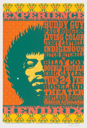
Generally, the exact opposite is true: When the 2004 Experience Hendrix Tour brought together the late legend's bandmates—drummer Mitch Mitchell and Band of Gypsys bassist Billy Cox—alongside the likes of Buddy Guy and Paul Rodgers to play Jimi's tunes at the Roseland Theater, Houston was ominously called backstage to meet with a rather imposing gentleman from the Hendrix camp. Expecting to be reprimanded, Houston was instead congratulated seeing as he was the only one with “enough balls” to do an uncommissioned poster for the show.
Four years later when the tour returned to town, he created a complimentary piece—this time for the show held at the much larger Schnitzer. Portland was the final date of the 18-city tour and, as many will recall, Mitchell died in his sleep five days later at the Benson Hotel.
Back in 1994 and '95 when King and Houston launched Voodoo Catbox, designing and printing concert posters rekindled something inside of Houston. He describes it as such: "There's this bicycle leaning up against the wall and you're like, 'Oh, I haven't ridden a bicycle for a while' and you get on it and you just take off, [remembering] 'I forgot how much I enjoyed riding a bicycle.'"
 The exhilaration of zooming downhill on that newly rediscovered bike is only half of the equation. What continued to fan the flames of fulfillment in those early days was the fact that "we can get into shows for free," Houston laughs. "You always hear that's kind of the crux of the matter. You don't care about how much work and you just think, 'I can make this and then scoot in.'"
Proof of his ability to not just scoot in but be recognized and welcomed also lies in the fact that "we've only had one cease and desist, which I thought was kind of cool," Houston confides with a smile.
Conscious of it or not, Houston has always been following a distinct path. "Those of us that can't play instruments still love music a lot so it's just been one of those guiding forces," he explains. Plus, concert posters afford him total creative freedom.
Welcome To The Catbox
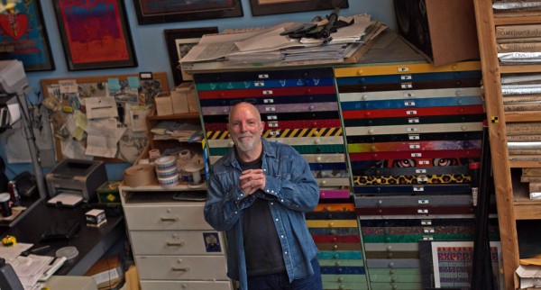
"This is the sandbox," Houston says of his 2,100-square-foot studio in the one-time Columbia Sportswear headquarters in St. Johns. The space feels like a well-lived-in museum. Even before crossing the threshold, the first thing you notice is the wafting scent of Nag Champa welcoming you. Despited his nom de plume, Houston is a dog lover, and you can glimpse small memorials to his dearly departed black labs around his studio (Opie's collar hangs from one of the studio's double doors) and on his website.
Rows of brightly colored posters of his and others' design cover almost every inch of wall space (even in the bathroom), while screen printing tools, ink, stickers, art materials and more take up valuable horizontal real estate. With more than the basic amenities, including a couch in the kitchen and bar area as well as a loft, the space is functional and cozy.
 A proud “music junkie,” there’s memorabilia scattered about with hoodoo-conjuring knickknacks, a plastic poncho featuring a winged guitar, and bottles of beer concentrated on the shelves near his light table. All in all, more than enough meaningful clutter to make any music fanatic salivate.
Stacks of DVDs supply a pair of small televisions near his two main work areas with the background noise he requires to work. Admirably, Houston is able to not just be productive but even produce beauty when he’s not able to peel himself away from trash TV shows—an intimate detail revealed by his studio assistant Sara McCormick, who deals with the digital aspects of his artwork. Today, it’s just the two of them with Houston retaining the nonsensical Voodoo Catbox name he invented, using it to brand his personal work over the years.
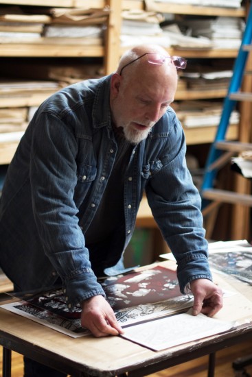
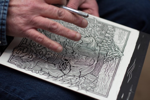
Houston stresses the organic nature of his craft, from sketching and inking with pen and paper, to refining illustrations on sheets of heavy-duty vellum before transferring his designs to scratchboard. His creative process is all very hands-on and the early stages can be done anywhere, which means he’s always toting notebooks and scratchboard with him.
“To be quite honest, to sit in front of a computer screen sounds like one of the most boring things to do on the planet. If you’re drawing, you’re always at odds with yourself,” he explains. “I like those days where I can’t draw my way out of a paper bag because then there are those days where it’s not me, it’s the pencil and you don’t want to even pick it up because it’s like it has a mind of it’s own.” Incessantly humble, he continues, “I can’t take credit for everything. I can take credit when I can’t draw my way out of a paper bag, but those days where it’s the pencil—that’s like this magic thing that happens.”
His scratchboard work is likely his most stylistically identifiable, and he fortunately enjoys this craft the most. “I love the whole process of scratchboarding. I like the conflict of it. I like the whole time of sitting there and working on it,” he enthuses.
“I like the fact that they can turn into little pieces of magic and they can also turn into little pieces of crap,” he quips, again displaying his quirky, creditless form of modesty.
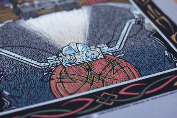
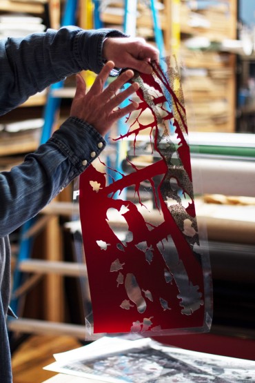 The completion of a scratchboard does not mean the piece has been finalized. In fact, the later stages of enlargement, creating transparent separations for screens, and finally hand-pulling each individual color allow for substantial creative flexing—especially when it comes to color. Houston begins making color decisions while hunched over his light table hand-cutting enlarged designs from Rubylith film, sometimes using an airbrush to add texture. Each layer of film will become a different color on the final poster, but first he must transfer his design to screens. The resulting screens are then used to print each color, one at a time, giving the finished poster the intricate tones, patterns and textures that provide depth within the two-dimensional medium.
“Our lives evolve around these little things we do—life is the color, life is the printing,” Houston says of the pleasure he derives from the various uncertainties at each stage throughout his process. Digital designers know exactly “what something is going to look like on their computer screen before it ever gets printed,” he describes. Houston’s art on the other hand is constantly materializing. “When I print something, I want to see what it looks like after I’ve put the final color on.”
Houston stresses that both scratchboarding and screen printing are “such organic processes that the two just work together so well. To me, they’re made for each other.” Both are hands-on, which allows Houston to “establish a relationship with each and every piece.” That said, both can be monotonous exercises so you learn to work quickly, developing “this sloppy reverence,” he explains.
The fun part is taking chances: “If it’s going to fail, I want it to fail miserably,” he says. “I have this habit of driving down the street, and if I see something I like, my thought is: ‘Damn, I wish I’d done that.’ I think we all do that. But there have been times where I’m printing here and we get that last color on and I’ll lift up the screen and my initial reaction is: ‘Damn, I wish I’d done that. Oh, we did!’” And every time he sees those pieces a shot of that awe-inspiring sensation courses through him.
With the type of repetitive information—date, time, place—that’s required to adorn concert posters, it’s the innumerable variables in approaching each project that keep Houston engaged. “You know, I’ve done this for a few years and I’m amazed that it’s always a learning process,” he says.
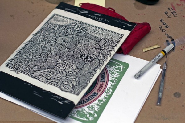 Houston continues an artistic theme with Robert Johnson-inspired artwork for the 2014 Blues FestivalHis work also relies on true artistic inspiration—he’ll never create a poster for a band that doesn’t appeal to him. The subject matter has to move him in the first place, and familiarity with an artist enables him to present a confident message or even add a little humor.
“We don’t want to be preachy but there are times where we want to put forth a kernel of a thought—maybe if only one person gets it then it’s worthwhile.” And it is rock and roll after all, so from the talons of eagles to flames and skeletons, Houston says, “I’ll put a skull on anything.”
Houston’s poster sandbox extends “beyond these walls,” he says. How could it not follow him with the impressive archive he’s built working primarily with blues, jazz and rock musicians over the years?
Although he claims he doesn’t pay attention to how many posters he produces each year, his current online offerings list some 400 posters for sale. But, McCormick stresses that “his archive is well over that.” Putting his mark on events and organizations from the Oregon Music Hall of Fame to the Portland Art Museum and the Crystal Ballroom’s recent centennial, Houston has also worked with Northwest acts like Mel Brown, The Decemberists, Robert Cray, The Dandy Warhols, Kelly Joe Phelps, Richmond Fontaine, Dharma Bums, Sallie Ford, Death Cab for Cutie, and The Helio Sequence.
At age 61, Houston doesn’t often feel the need to explain his work—it’s up to the beholder to interpret and create his or her own meaning. That said, he definitely has opinions and a clear point of view when creating work—he’s just not the type of guy to get up onstage and announce it. He’ll leave that to the musicians.
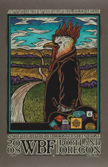 Yet, he distinctly recalls when Waterfront Blues Festival producer Clay Fuller surprised him just a few years into his tenure with the fest. “I remember coming in the day of the setup and I met Clay at the top of the hill. He just had this little heh heh heh thing, like ‘Wait’ll he sees these.’” He felt the wind knocked from him as he saw his scratchboard scenes of Robert Johnson from the previous years—formerly used on posters and T-shirts—printed on massive sections of white vinyl that cover the scaffolding of each stage. And for more than a decade now, his artwork, in all its iterations, has given the festival a consistent and distinctive image.
“There are times I feel great about that and other times I feel a little sheepish about it thinking that this wasn’t done on purpose—circumstance dictated all this stuff,” Houston says.
Sure, serendipity has smiled upon Houston, but he doesn’t take any of it for granted. “Every year that I do this [the Blues Fest], my thought is, ‘Well, this is our last year.’ I’m sure there are people standing in line waiting to do this.” But the opportunity continues to fall in his lap each winter, and every year, he gives himself a little pep talk—the same one he gives himself before transferring a sketch to scratchboard.
“Don’t be shy. Don’t be timid,” he tells himself in the moment before he assuredly presses his number 11 X-Acto blade into the black ink that covers the clay coating of the scratchboard, revealing a stark white line.
It’s easy to be timid. Timidity leads to cautious progress—countless minuscule scratches that lack energy and ultimately lead to a muddled product. “It’s much easier to give yourself that pep talk and go in and slash and burn,” Houston says.
Slashing and burning leads to spontaneity, he says, and it’s obvious that Houston trusts in his ability in these situations. As he describes the process he undertakes to craft the iconic designs that blanket the Blues Fest each year, you realize that he could just as easily be talking about preparing to play that same stage.
You rehearse in the days and hours leading up to showtime, but when it’s time for you to go live, you just have to unleash your creativity. Let your inhibitions run wild while finding your groove—trust your practice and experience to shine, to create “a sense of immediacy,” of living in the here and now.
 It’s not likely that we’ll see Houston overtly showcasing his talents onstage anytime soon. In fact, in the moments before leaving his North Portland studio after hours of conversation and storytelling, digging through piles of poster archives, and perusing a wall of CDs (which he claims is him doing his part to keep Terry Currier’s Music Millennium in business), he tells me that the real story is about poster-making being in its infancy as an art form.
Sorry, Gary Houston—this story’s about you.